Android 3.0 is upon us and Google has revealed some of its unique features. We break down and explain each new feature and what it means to you. Features include 3D effects, bluetooth tethering, new UI, an Action Bar, a new System Bar, customizable home screens, improved apps, and more.
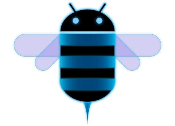
In a small sign that Android 3.0 is nearing release, Google has created a preview page and SDK for Honeycomb (its internal codename) developers. Digging around, some coders even found the new logo (seen above).From the new logo and design, it’s clear that Google’s designers saw Tron Legacy and thoroughly enjoyed the futuristic, neon, cyan computer world of the film. Honeycomb is the first tablet version of Android. Everything from the navigation buttons to the effects to the clock in Android 3.0 has a sci-fi geekness to it. Fortunately, we like that.
Below we’ve listed some new features and screenshots of the upcoming tablet OS, which will debut with the Motorola Xoom on Feb. 17. Much of this information comes via Google’s Android developer blog.
Honeycomb’s new features

Soft navigation buttons: The first thing you’ll notice about Android 3.0 is the lack of physical buttons on most devices. Google has eliminated the Search button and moved the Home, Back, and Menu buttons onto the screen itself. They sit in the lower left of the unit and minimize themselves down to a few pixels thick when certain apps are running. Hopefully they will look a bit nicer when the OS ships.
System Bar: The soft navigation buttons are on the left side of the new System Bar, which has moved to the bottom of the screen. (In previous Android versions, it was on top.) It displays status notifications and status updates. In addition, it can minimize itself when unneeded to give you some extra screen space. Notifications are also improved, allowing more pictures and more real-time information to be shared without having to open the app.
Action Bar: Much like on a Mac, the Action Bar is an app-specific bar along the top of the screen that can display context-sensitive options or drop-down menus. It vanishes when no app is open.
Five home screens: By default, Android 3.0 will have five customizable home screens (desktops). You can add differently sized shortcuts and widgets to this screen, as well as change the background. Honeycomb has a new visual layout mode that lets you more easily modify your pages and add drop shadows and other visual cues.

Multitasking: In addition to the System Bar notifications your used to, there is a new Recent Apps list in the System Bar that shows a picture of what you were doing in each app before you minimized it and lets you hot swap between programs.
New keyboard: The keyboard has been redesigned to better fit larger screened tablets. Google also added in new keys like “Tab.” You can also touch-hold keys to get special characters (much like how you hold SHIFT on your laptop or desktop).
Easier copy/paste, multiselect, clipboard, drag and drop: It is now easier to select passages of text and copy, share, search, or paste them. We’re hoping this feature extends to all apps, allowing you to copy any text on any screen, much like a desktop. In spreadsheets or other content-rich apps, developers can enable multiselecting options, allowing users to select different cells or multiple pieces of content at once. Finally, Honeycomb will have a clipboard, much like your desktop, allowing pictures and other media rich items to be copied and pasted between applications. This feature will have drag-and-drop functionality, allowing you to literally pull a piece of content from one app or area to another.

New widgets: Honeycomb will have redesigned main widgets like clocks and such, but also allows developers to make more complex and nicer widgets on their own. 3D stacking, search boxes, calendars, fancy “holographic” effects, etc will start popping up in app widgets soon.
Updated apps: All of the standard apps–Browser, Camera, Gallery, Contacts, Email–have gotten a makeover for Honeycomb. Expect more options, prettier UI, and new tablet features.
New technical features
Bluetooth tethering: Android 3.0 looks prettier, but it also has some new data features, like Bluetooth tethering. If your carrier allows it, you’ll be able to share your mobile Internet connection with devices over Bluetooth, a popular form of short-range wireless data transfer.Media/photo USB sync: Photos and media can be synced instantly to a desktop or laptop computer when you connect via USB.
USB keyboard: In addition to syncing photos, you can also attach a USB keyboard to Android 3.0 devices. This is useful when you run out of Netflix movies to watch and have already beaten Angry Birds. A real keyboard allows you to get actual work done.
Live streaming: Now applications can stream M3U playlists via HTTP, allowing a wider range of audio and video streaming options to open up. Hopefully Google will come up with a great way to back up music and media collections to the cloud or stream them from remote locations to your tablet/phone.

Activity fragments: This feature is great for developers, but difficult to explain. Basically, it allows developers to split up apps into multiple “fragments” or sections and treat each section differently, depending on context. This lets developers create apps that know how to properly re-orient themselves when installed on a phone or tablet. For instance, Google’s Gmail app is just a list of emails on your phone, but if you open that app up on a tablet, it separates itself into 2 columns, allowing you to browse a list of emails on the left side of the screen while you read the emails on the right.
 3D graphics support: No, not pop out of the screen 3D. We just mean polygons and things that simulate 3D effects. Developers can now build 3D effects in apps, wallpapers, carousels, etc. Apps will also be able to take better advantage of each tablet’s hardware, enabling prettier animations and user interfaces (UI).
Multicore processor support: The Motorola Xoom already has a dual-core Tegra 2 processor, so you may know about this already. Multiple cores are no problem for Honeycomb.
Conclusion
Android 3.0 is the largest overhaul of Android to date. It shows that Google is not opposed to making big changes to its OS to improve the experience. The tablet-based system seems to borrow features from Windows and Mac desktops as well as some of the modified Android UIs that manufacturers have been putting out. The only thing we’re confused about is why Google has chosen to make Honeycomb a tablet-only OS version. Wouldn’t it be smarter to call it Android Tablet 1.0 or something? With smartphones running Android 2.3, it may get confusing when Google’s next OS version is technically Android 2.4. Hopefully a version of Android 3.0 will eventually come to the small screen.Source : http://www.digitaltrends.com/mobile/android-3-0-honeycomb-new-feature-breakdown-with-screenshots/


No comments:
Post a Comment